Kotlin Swing
last modified January 29, 2024
This article shows how to create Swing GUI applications in Kotlin. The code examples and image are available at the author's Github Kotlin-Swing repository.
Swing is the principal GUI toolkit for JVM. It is a library which enables us to create powerful GUI applications.
Kotlin Swing JFrame
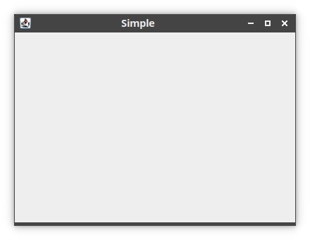
In the first example, we show a basic window on the screen.
The main application window is created with JFrame.
package com.zetcode

import java.awt.EventQueue
import javax.swing.JFrame

class SimpleEx(title: String) : JFrame() {

    init {
        createUI(title)
    }

    private fun createUI(title: String) {

        setTitle(title)

        defaultCloseOperation = EXIT_ON_CLOSE
        setSize(400, 300)
        setLocationRelativeTo(null)
    }
}

private fun createAndShowGUI() {

    val frame = SimpleEx("Simple")
    frame.isVisible = true
}

fun main() {
    EventQueue.invokeLater(::createAndShowGUI)
}
The window is placed in the center of the screen.
class SimpleEx(title: String) : JFrame() {
SimpleEx inherits from the JFrame component.
JFrame is a top-level container. The purpose of containers is to
hold components of the application.
setTitle(title)
The title of the application is set with setTitle.
defaultCloseOperation = EXIT_ON_CLOSE
The defaultCloseOperation sets the operation that will happen by
default when closes the frame. In our case, we exit the application.
setSize(400, 300)
We set the initial size with setSize.
setLocationRelativeTo(null)
This line is used to center the window on the screen.
val frame = SimpleEx("Simple")
frame.isVisible = true
We create the application frame and show it on screen.
EventQueue.invokeLater(::createAndShowGUI)
The invokeLater method places the application on the Swing Event
Queue. It is used to ensure that all UI updates are concurrency-safe.
Kotlin Swing JButton
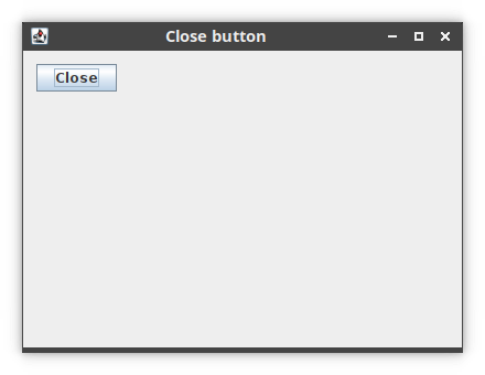
In the next example, we have a close button. A button component is
created with JButton. When we click on the button, the
application terminates.
package com.zetcode

import java.awt.EventQueue
import javax.swing.GroupLayout
import javax.swing.JButton
import javax.swing.JComponent
import javax.swing.JFrame

import kotlin.system.exitProcess

class CloseButtonEx(title: String) : JFrame() {

    init {
        createUI(title)
    }

    private fun createUI(title: String) {

        setTitle(title)

        val closeBtn = JButton("Close")

        closeBtn.addActionListener { exitProcess(0) }

        createLayout(closeBtn)

        defaultCloseOperation = EXIT_ON_CLOSE
        setSize(400, 300)
        setLocationRelativeTo(null)
    }


    private fun createLayout(vararg arg: JComponent) {

        val gl = GroupLayout(contentPane)
        contentPane.layout = gl

        gl.autoCreateContainerGaps = true

        gl.setHorizontalGroup(
            gl.createSequentialGroup()
                .addComponent(arg[0])
        )

        gl.setVerticalGroup(
            gl.createSequentialGroup()
                .addComponent(arg[0])
        )

        pack()
    }
}

private fun createAndShowGUI() {

    val frame = CloseButtonEx("Close button")
    frame.isVisible = true
}

fun main() {
    EventQueue.invokeLater(::createAndShowGUI)
}
We position a JButton on the window and add an action listener to
this button.
val closeBtn = JButton("Close")
A button component is created. The constructor takes a string label as a parameter.
closeBtn.addActionListener { exitProcess(0) }
An action listener is added to the button with addActionListener.
The action terminates the application by calling the exitProcess
method.
createLayout(closeBtn)
The child components, in our case one button, need to be placed into
containers. We delegate the task to the createLayout method.
val gl = GroupLayout(contentPane)
contentPane.layout = gl
The content pane of a JFrame is an area where child components are
placed. The children are organised by specialised non-visible components called
layout managers. BorderLayout is the default layout manager of a
content pane. This manager is very simple and is useful only in limited cases.
We use the GroupLayout manager which is more powerful and flexible.
gl.autoCreateContainerGaps = true
The autoCreateContainerGaps attribute creates gaps between
components and the edges of the container. Space or gaps are important
part of the design of each application.
gl.setHorizontalGroup(
    gl.createSequentialGroup()
        .addComponent(arg[0])
)

gl.setVerticalGroup(
    gl.createSequentialGroup()
        .addComponent(arg[0])
)
GroupLayout manager defines the layout for each dimension
independently. In one step, we lay out components alongside the horizontal axis;
in the other step, we lay out components along the vertical axis. In both kinds
of layouts we can arrange components sequentially or in parallel. In a
horizontal layout, a row of components is called a sequential group and a column
of components is called a parallel group. In a vertical layout, a column of
components is called a sequential group and a row of components a parallel
group.
In our example we have only one button, so the layout is very simple. For each
dimension, we call the addComponent method with the button
component as a parameter. (Each child component must be added for both
dimensions.)
Kotlin Swing JLabel
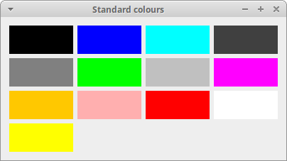
JLabel component is used to display text, colours, or images.
package com.zetcode

import java.awt.Color
import java.awt.Dimension
import java.awt.EventQueue
import javax.swing.GroupLayout
import javax.swing.JFrame
import javax.swing.JLabel
import javax.swing.SwingConstants.LEADING


class StandardColoursEx(title: String) : JFrame() {

    init {
        createUI(title)
    }

    private fun createUI(title: String) {

        val stdCols = arrayOf<Color>(
            Color.black, Color.blue, Color.cyan,
            Color.darkGray, Color.gray, Color.green, Color.lightGray, Color.magenta,
            Color.orange, Color.pink, Color.red, Color.white, Color.yellow
        )

        val labels = stdCols.map {
            JLabel("", null, LEADING).apply {

                minimumSize = Dimension(90, 40)
                background = it
                isOpaque = true
            }
        }

        createLayout(labels)

        setTitle(title)
        defaultCloseOperation = EXIT_ON_CLOSE
        setLocationRelativeTo(null)
    }

    private fun createLayout(labels: List<JLabel>) {

        val gl = GroupLayout(contentPane)
        contentPane.layout = gl

        gl.autoCreateContainerGaps = true
        gl.autoCreateGaps = true

        gl.setHorizontalGroup(
            gl.createParallelGroup()
                .addGroup(
                    gl.createSequentialGroup()
                        .addComponent(labels[0])
                        .addComponent(labels[1])
                        .addComponent(labels[2])
                        .addComponent(labels[3])
                )
                .addGroup(
                    gl.createSequentialGroup()
                        .addComponent(labels[4])
                        .addComponent(labels[5])
                        .addComponent(labels[6])
                        .addComponent(labels[7])
                )
                .addGroup(
                    gl.createSequentialGroup()
                        .addComponent(labels[8])
                        .addComponent(labels[9])
                        .addComponent(labels[10])
                        .addComponent(labels[11])
                )
                .addComponent(labels[12])
        )

        gl.setVerticalGroup(
            gl.createSequentialGroup()
                .addGroup(
                    gl.createParallelGroup()
                        .addComponent(labels[0])
                        .addComponent(labels[1])
                        .addComponent(labels[2])
                        .addComponent(labels[3])
                )
                .addGroup(
                    gl.createParallelGroup()
                        .addComponent(labels[4])
                        .addComponent(labels[5])
                        .addComponent(labels[6])
                        .addComponent(labels[7])
                )
                .addGroup(
                    gl.createParallelGroup()
                        .addComponent(labels[8])
                        .addComponent(labels[9])
                        .addComponent(labels[10])
                        .addComponent(labels[11])
                )
                .addComponent(labels[12])
        )

        pack()
    }
}

private fun createAndShowGUI() {

    val frame = StandardColoursEx("Standard colours")
    frame.isVisible = true
}

fun main() {
    EventQueue.invokeLater(::createAndShowGUI)
}
The example shows thirteen JLabel components; each of the labels
has a different background colour. JLabel is usually used to
display text; but it can display colours, too.
val stdCols = arrayOf<Color>(Color.black, Color.blue, Color.cyan,
    Color.darkGray, Color.gray, Color.green, Color.lightGray, Color.magenta,
    Color.orange, Color.pink, Color.red, Color.white, Color.yellow)
Here we have an array of the built-in colour values.
val labels = stdCols.map {
    JLabel("", null, LEADING).apply {

        minimumSize = Dimension(90, 40)
        background = it
        isOpaque = true
    }
}
The labels are created with a certain size and background colour.
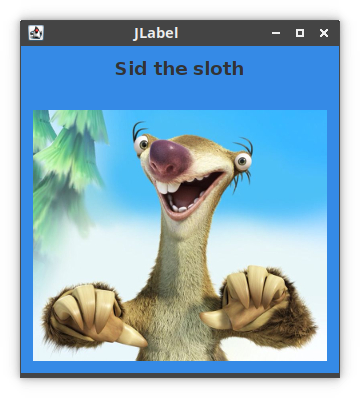
In the following example, we display a text and an image.
package com.zetcode

import java.awt.Color
import java.awt.EventQueue
import javax.swing.GroupLayout
import javax.swing.ImageIcon
import javax.swing.JComponent
import javax.swing.JFrame
import javax.swing.JLabel

class LabelsEx(title: String) : JFrame() {

    init {
        createUI(title)
    }

    private fun createUI(title: String) {

        val title2 = JLabel("Sid the sloth")
        title2.font = title2.font.deriveFont(18f)

        val img = JLabel(ImageIcon("src/main/resources/sid.jpg"))

        createLayout(title2, img)

        contentPane.background = Color(0x358ae6)

        setTitle(title)

        defaultCloseOperation = EXIT_ON_CLOSE
        setLocationRelativeTo(null)
    }

    private fun createLayout(vararg arg: JComponent) {

        val gl = GroupLayout(contentPane)
        contentPane.layout = gl

        gl.autoCreateContainerGaps = true

        gl.setHorizontalGroup(
            gl.createParallelGroup(GroupLayout.Alignment.CENTER)
                .addGap(60, 150, Integer.MAX_VALUE)
                .addComponent(arg[0])
                .addComponent(arg[1])
        )

        gl.setVerticalGroup(
            gl.createSequentialGroup()
                .addComponent(arg[0])
                .addGap(30)
                .addComponent(arg[1])
        )

        pack()
    }
}

private fun createAndShowGUI() {

    val frame = LabelsEx("JLabel")
    frame.isVisible = true
}

fun main() {
    EventQueue.invokeLater(::createAndShowGUI)
}
There are two labels in the program. One displays a title and one a JPEG image.
val title2 = JLabel("Sid the sloth")
title2.font = title2.font.deriveFont(18f)
This label displays text. The font is enlarged.
val img = JLabel(ImageIcon("src/main/resources/sid.jpg"))
This label displays an image.
contentPane.background = Color(0x358ae6)
For a better contrast, we change the background to some bluish colour.
gl.setHorizontalGroup(
    gl.createParallelGroup(GroupLayout.Alignment.CENTER)
        .addGap(60, 150, Integer.MAX_VALUE)
        .addComponent(arg[0])
        .addComponent(arg[1])
)
With GroupLayout.Alignment.CENTER alignment, we center the
components horizontally according to the size of the largest item. Since we have
inserted a gap with a very large maximum size, the labels are contered on the
window in the horizontal diretion.
Kotlin Swing JCheckBox
JCheckBox is a box with a label that has two states: on and off. If
the check box is selected, it is represented by a tick in a box. A check box can
be used to show or hide a splashscreen at startup, toggle visibility of a
toolbar etc.
With JCheckBox it is possible to use an ActionListener
or an ItemListener. Usually the latter option is used.
ItemListener is the interface for receiving item events. The class
that is interested in processing an item event, e.g. the observer, implements
this interface. The observer object is registered with a component using the
component's addItemListener method. When an item selection event
occurs, the observer's itemStateChanged method is invoked.
package com.zetcode

import java.awt.EventQueue
import java.awt.event.ItemEvent
import javax.swing.GroupLayout
import javax.swing.JCheckBox
import javax.swing.JComponent
import javax.swing.JFrame

class CheckBoxEx(title: String) : JFrame() {

    init {
        createUI(title)
    }

    private fun createUI(title: String) {

        setTitle(title)

        val checkBox = JCheckBox("Show title", true)

        checkBox.addItemListener { e ->

            val sel: Int = e.stateChange

            if (sel == ItemEvent.SELECTED) {
                setTitle("JCheckBox")
            } else {
                setTitle("")
            }
        }

        createLayout(checkBox)

        defaultCloseOperation = EXIT_ON_CLOSE
        setSize(400, 300)
        setLocationRelativeTo(null)
    }

    private fun createLayout(vararg arg: JComponent) {

        val gl = GroupLayout(contentPane)
        contentPane.layout = gl

        gl.autoCreateContainerGaps = true

        gl.setHorizontalGroup(gl.createSequentialGroup()
            .addComponent(arg[0])
        )

        gl.setVerticalGroup(gl.createSequentialGroup()
            .addComponent(arg[0])
        )

        pack()
    }
}

private fun createAndShowGUI() {

    val frame = CheckBoxEx("JCheckBox")
    frame.isVisible = true
}

fun main() {
    EventQueue.invokeLater(::createAndShowGUI)
}
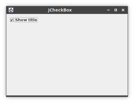
Our code example shows or hides the title of the window depending whether the check box is selected.
val checkBox = JCheckBox("Show title", true)
JCheckBox is created. This constructor takes a text and the state
of the check box as parameters. The check box is initially selected.
checkBox.addItemListener { e ->

    val sel: Int = e.stateChange

    if (sel == ItemEvent.SELECTED) {
        setTitle("JCheckBox")
    } else {
        setTitle("")
    }
}
An item listener is added with addItemListener. Depending on the
state of the check box, we show or hide the window title.
Kotlin Swing JSlider
JSlider is a component that lets the user graphically select a
value by sliding a knob within a bounded interval. Whe the slider's knob is
moved, the stateChanged method of the slider's
ChangeListener is called.
JSlider can optionally show tick marks for the range of its values.
The tick marks are set with the setMinorTickSpacing,
setMajorTickSpacing, and setPaintTicks methods.
package com.zetcode

import java.awt.EventQueue
import javax.swing.GroupLayout
import javax.swing.JComponent
import javax.swing.JFrame
import javax.swing.JLabel
import javax.swing.JSlider

class SliderEx(title: String) : JFrame() {

    private lateinit var slider: JSlider
    private lateinit var lbl: JLabel

    init {
        createUI(title)
    }

    private fun createUI(title: String) {

        slider = JSlider(0, 100, 0)
        slider.minorTickSpacing = 5
        slider.majorTickSpacing = 10
        slider.paintTicks = true

        slider.addChangeListener {

            val value: Int = slider.value
            lbl.text = value.toString()
        }

        lbl = JLabel("...")

        createLayout(slider, lbl)
        setTitle(title)

        defaultCloseOperation = EXIT_ON_CLOSE
        setSize(400, 350)
        setLocationRelativeTo(null)
    }


    private fun createLayout(vararg arg: JComponent) {

        val pane = contentPane
        val gl = GroupLayout(pane)
        pane.layout = gl

        gl.autoCreateContainerGaps = true
        gl.autoCreateGaps = true

        gl.setHorizontalGroup(
            gl.createParallelGroup()
                .addComponent(arg[0])
                .addComponent(arg[1])
        )
        gl.setVerticalGroup(
            gl.createSequentialGroup()
                .addComponent(arg[0])
                .addComponent(arg[1])
        )
        pack()
    }
}

private fun createAndShowGUI() {

    val frame = SliderEx("Slider")
    frame.isVisible = true
}

fun main() {
    EventQueue.invokeLater(::createAndShowGUI)
}
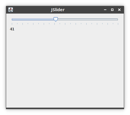
A selected value from a slider is displayed in the adjacent label component.
slider = JSlider(0, 100, 0)
A JSlider is created with the minimum, maximum, and current values
as parameters.
slider.minorTickSpacing = 5
slider.majorTickSpacing = 10
We set the distances between minor a major tick marks.
slider.paintTicks = true
The paintTicks property determines whether tick marks are painted
on the slider.
slider.addChangeListener {

    val value: Int = slider.value
    lbl.text = value.toString()
}
A ChangeEvent is triggered when the slider has changed in some way.
We get the current value of the slider with ChangeEvent , convert
the integer into a string with toString and set it to the label
through the text property.
Kotlin Swing JComboBox
JComboBox is a component that combines a button or editable field
and a drop-down list. The user can select a value from the drop-down list, which
appears at the user's request. If we make the combo box editable, then the
combo box includes an editable field into which the user can type a value.
package com.zetcode

import java.awt.EventQueue
import java.awt.event.ItemEvent
import java.awt.event.ItemListener
import javax.swing.GroupLayout
import javax.swing.GroupLayout.Alignment.BASELINE
import javax.swing.JComboBox
import javax.swing.JComponent
import javax.swing.JFrame
import javax.swing.JLabel

class ComboBoxEx(title: String) : JFrame(), ItemListener {

    private lateinit var display: JLabel
    private lateinit var box: JComboBox<String>

    init {
        createUI(title)
    }

    private fun createUI(title: String) {

        val distros = arrayOf(
            "Ubuntu", "Redhat", "Arch",
            "Debian", "Mint"
        )

        box = JComboBox<String>(distros)
        box.font = box.font.deriveFont(14f)
        box.addItemListener(this)

        display = JLabel("Ubuntu")
        display.font = display.font.deriveFont(14f)

        createLayout(box, display)

        setTitle(title)

        defaultCloseOperation = EXIT_ON_CLOSE
        setSize(400, 350)
        setLocationRelativeTo(null)
    }

    override fun itemStateChanged(e: ItemEvent) {

        if (e.stateChange == ItemEvent.SELECTED) {
            display.text = e.item.toString()
        }
    }

    private fun createLayout(vararg arg: JComponent) {

        val pane = contentPane
        val gl = GroupLayout(pane)
        pane.layout = gl

        gl.autoCreateContainerGaps = true
        gl.autoCreateGaps = true

        gl.setHorizontalGroup(
            gl.createSequentialGroup()
                .addComponent(arg[0])
                .addComponent(arg[1])
        )
        gl.setVerticalGroup(
            gl.createParallelGroup(BASELINE)
                .addComponent(arg[0])
                .addComponent(arg[1])
        )
        pack()
    }
}

private fun createAndShowGUI() {

    val frame = ComboBoxEx("JComboBox")
    frame.isVisible = true
}

fun main() {
    EventQueue.invokeLater(::createAndShowGUI)
}
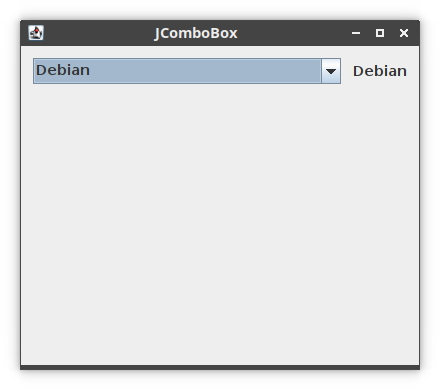
We have a combo box and a label. The combo box contains a list of Linux
distributions. The selected item from the combo box is displayed in the adjacent
label. The combo box uses its ItemListener to detect changes.
class ComboBoxEx(title: String) : JFrame(), ItemListener {
The ComboBoxEx implements the ItemListener; it must
override the itemStateChanged function.
val distros = arrayOf(
    "Ubuntu", "Redhat", "Arch",
    "Debian", "Mint"
)

box = JComboBox<String>(distros)
A JComboBox is created.
box.font = box.font.deriveFont(14f)
We increase the font of the combo box.
box.addItemListener(this)
The implementation of the item listener's contract function is within this class.
gl.setVerticalGroup(
    gl.createParallelGroup(BASELINE)
        .addComponent(arg[0])
        .addComponent(arg[1])
)
Vertically, the two components will be aligned to the baseline of their text.
override fun itemStateChanged(e: ItemEvent) {

    if (e.stateChange == ItemEvent.SELECTED) {
        display.text = e.item.toString()
    }
}
The itemStateChanged is invoked when an item has been selected or
deselected by the user. We check for ItemEvent.SELECTED state and
set the combo box's selected item to the label.
Swing icons
In the next example, we show icons in a JLabel component.
package com.zetcode

import java.awt.EventQueue
import javax.swing.GroupLayout
import javax.swing.ImageIcon
import javax.swing.JComponent
import javax.swing.JFrame
import javax.swing.JLabel

class LabelIconsEx(title: String) : JFrame() {

    init {
        createUI(title)
    }

    private fun createUI(title: String) {

        val lbl1 = JLabel(ImageIcon("src/main/resources/cpu.png"))
        val lbl2 = JLabel(ImageIcon("src/main/resources/drive.png"))
        val lbl3 = JLabel(ImageIcon("src/main/resources/laptop.png"))
        val lbl4 = JLabel(ImageIcon("src/main/resources/player.png"))

        createLayout(lbl1, lbl2, lbl3, lbl4)

        setTitle(title)
        defaultCloseOperation = EXIT_ON_CLOSE
        setLocationRelativeTo(null)
    }

    private fun createLayout(vararg arg: JComponent) {

        val gl = GroupLayout(contentPane)
        contentPane.layout = gl

        gl.autoCreateContainerGaps = true
        gl.autoCreateGaps = true

        gl.setHorizontalGroup(
            gl.createSequentialGroup()
                .addComponent(arg[0])
                .addComponent(arg[1])
                .addComponent(arg[2])
                .addComponent(arg[3])
        )

        gl.setVerticalGroup(
            gl.createParallelGroup()
                .addComponent(arg[0])
                .addComponent(arg[1])
                .addComponent(arg[2])
                .addComponent(arg[3])
        )

        pack()
    }
}

private fun createAndShowGUI() {

    val frame = LabelIconsEx("Icons")
    frame.isVisible = true
}

fun main() {
    EventQueue.invokeLater(::createAndShowGUI)
}
The example shows four images in one row.
val lbl1 = JLabel(ImageIcon("src/main/resources/cpu.png"))
The image path is passed to the ImageIcon.
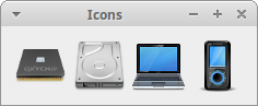
Kotlin Swing menu example
JMenuBar implements a menu bar. JMenu implements
a menu, which is a popup window containing JMenuItems that is
displayed when the user selects an item on the JMenuBar.
JMenuItem implements an item in a menu. It is selected by the user
to perform an action.
package com.zetcode

import java.awt.EventQueue
import java.awt.event.ActionEvent
import java.awt.event.KeyEvent
import javax.swing.ImageIcon
import javax.swing.JFrame
import javax.swing.JMenu
import javax.swing.JMenuBar
import javax.swing.JMenuItem
import kotlin.system.exitProcess

class SimpleMenuEx(title: String) : JFrame() {

    init {
        createUI(title)
    }

    private fun createUI(title: String) {

        setTitle(title)

        createMenuBar()

        defaultCloseOperation = EXIT_ON_CLOSE
        setSize(400, 300)
        setLocationRelativeTo(null)
    }

    private fun createMenuBar() {

        val menubar = JMenuBar()
        val icon = ImageIcon("src/main/resources/exit.png")

        val file = JMenu("File")
        file.mnemonic = KeyEvent.VK_F

        val eMenuItem = JMenuItem("Exit", icon)
        eMenuItem.mnemonic = KeyEvent.VK_E
        eMenuItem.toolTipText = "Exit application"
        eMenuItem.addActionListener { _: ActionEvent -> exitProcess(0) }

        file.add(eMenuItem)

        menubar.add(file)

        jMenuBar = menubar
    }
}

private fun createAndShowGUI() {

    val frame = SimpleMenuEx("Simple menu")
    frame.isVisible = true
}

fun main() {
    EventQueue.invokeLater(::createAndShowGUI)
}
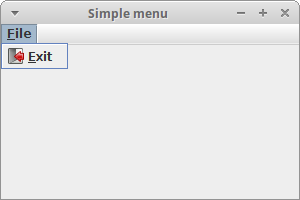
The example creates a simple menu with one menu item. Selecting the Exit menu item we close the application.
val menubar = JMenuBar()
A menubar is created with JMenuBar.
val icon = ImageIcon("src/main/resources/exit.png")
An Exit icon is displayed in the menu.
val file = JMenu("File")
file.mnemonic = KeyEvent.VK_F
A menu object is created with the JMenu class. The menus can be
accessed via keyboard as well. To bind a menu to a particular key, we use the
setMnemonic method. In our case, the menu can be opened with
the Alt+F+E.
eMenuItem.toolTipText = "Exit application"
This code line creates a tooltip for the menu item.
eMenuItem.addActionListener { _: ActionEvent -> exitProcess(0) }
JMenuItem is a special kind of a button component. We add an action
listener to it; it terminates the application when selected.
file.add(eMenuItem)
menubar.add(file)
The menu item is added to the menu object and the menu object is inserted into the menubar.
jMenuBar = menubar
The menubar is set to the jMenubar property of the JFrame.
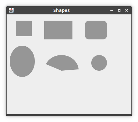
Kotlin Swing paint shapes
In the following example, we paint shapes on the window.
package com.zetcode

import java.awt.Color
import java.awt.EventQueue
import java.awt.Graphics
import java.awt.Graphics2D
import java.awt.RenderingHints
import java.awt.geom.Ellipse2D
import javax.swing.JFrame
import javax.swing.JPanel

class Surface : JPanel() {

    private fun doDrawing(g: Graphics) {

        val g2d = g as Graphics2D
        g2d.paint = Color(150, 150, 150)

        val rh = RenderingHints(
            RenderingHints.KEY_ANTIALIASING,
            RenderingHints.VALUE_ANTIALIAS_ON
        )
        rh[RenderingHints.KEY_RENDERING] = RenderingHints.VALUE_RENDER_QUALITY
        g2d.setRenderingHints(rh)

        g2d.fillRect(30, 20, 50, 50)
        g2d.fillRect(120, 20, 90, 60)
        g2d.fillRoundRect(250, 20, 70, 60, 25, 25)
        g2d.fill(Ellipse2D.Double(10.0, 100.0, 80.0, 100.0))
        g2d.fillArc(120, 130, 110, 100, 5, 150)
        g2d.fillOval(270, 130, 50, 50)
    }

    public override fun paintComponent(g: Graphics) {
        super.paintComponent(g)

        doDrawing(g)
    }
}

class ShapesEx(title: String) : JFrame() {

    init {
        createUI(title)
    }

    private fun createUI(title: String) {

        add(Surface())

        setTitle(title)

        defaultCloseOperation = EXIT_ON_CLOSE
        setSize(400, 350)
        setLocationRelativeTo(null)
    }
}

private fun createAndShowGUI() {

    val frame = ShapesEx("Shapes")
    frame.isVisible = true
}

fun main() {
    EventQueue.invokeLater(::createAndShowGUI)
}
We draw six basic shapes on the panel: a square, a rectangle, a rounded rectangle, an ellipse, an arc, and a circle.
public override fun paintComponent(g: Graphics) {
    super.paintComponent(g)

    doDrawing(g)
}
The drawing is done in the paintComponent method. We delegate the
drawing routines to the doDrawing method.
val g2d = g as Graphics2D
The Graphics2D is the interface to the Swing drawing API.
val rh = RenderingHints(
    RenderingHints.KEY_ANTIALIASING,
    RenderingHints.VALUE_ANTIALIAS_ON
)
rh[RenderingHints.KEY_RENDERING] = RenderingHints.VALUE_RENDER_QUALITY
g2d.setRenderingHints(rh)
We set rendering hints to have high rendering quality.
g2d.fillRect(30, 20, 50, 50)
g2d.fillRect(120, 20, 90, 60)
The fillRect method is used to draw both a rectangle and a square.
The first two parameters are x, y coordinates of a shape to be drawn. The last
two parameters are the width and the height of the shape.
g2d.fillRoundRect(250, 20, 70, 60, 25, 25)
Here we create a rounded rectangle. The last two parameters are the horizontal and vertical diameters of the arc at the four corners.
g2d.fill(Ellipse2D.Double(10.0, 100.0, 80.0, 100.0))
The fill method draws the interior of the given shape—an ellipse.
g2d.fillArc(120, 130, 110, 100, 5, 150)
The fillArc method fills a circular or elliptical arc covering the
specified rectangle. An arc is a portion of the circumference of a circle.
g2d.fillOval(270, 130, 50, 50)
A circle is drawn using the fillOval method.
Source
In this article we have introduced Swing toolkit with Kotlin language.
Author
List all Kotlin tutorials.