Python Matplotlib
last modified January 29, 2024
In this article we show how to create charts in Python with Matplotlib. We create a scatter chart, line chart, bar chart, and pie chart.
Matplotlib
Matplotlib is a Python library for creating charts. Matplotlib can be used in Python scripts, the Python and IPython shell, the jupyter notebook, web application servers, and four graphical user interface toolkits.
Matplotlib installation
Matplotlib is an external Python library that needs to be installed.
$ pip install matplotlib
We can use the pip tool to install the library.
Matplotlib scatter chart
A scatter chart is a type of plot or mathematical diagram using Cartesian coordinates to display values for typically two variables for a set of data.
#!/usr/bin/python
import matplotlib.pyplot as plt
x_axis = [1, 2, 3, 4, 5, 6, 7, 8, 9, 10]
y_axis = [5, 16, 34, 56, 32, 56, 32, 12, 76, 89]
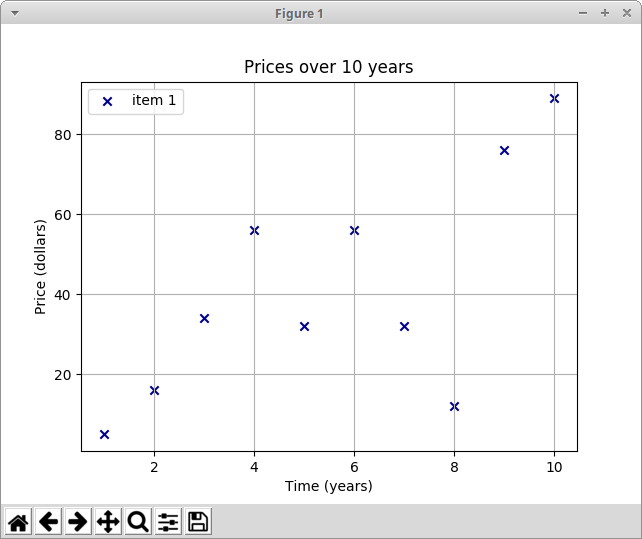
plt.title("Prices over 10 years")
plt.scatter(x_axis, y_axis, color='darkblue', marker='x', label="item 1")
plt.xlabel("Time (years)")
plt.ylabel("Price (dollars)")
plt.grid(True)
plt.legend()
plt.show()
The example draws a scatter chart. The chart displays the prices of some item over the period of ten years.
import matplotlib.pyplot as plt
We import the pyplot from the matplotlib module.
It is a collection of command style functions that create charts. It is similar
in operation to MATLAB.
x_axis = [1, 2, 3, 4, 5, 6, 7, 8, 9, 10]
y_axis = [5, 16, 34, 56, 32, 56, 32, 12, 76, 89]
We have data for x and y axes.
plt.title("Prices over 10 years")
With the title function, we set a title for the chart.
plt.scatter(x_axis, y_axis, color='darkblue', marker='x', label="item 1")
The scatter function draws the scatter chart. It accepts
the data for the x and y axes, the color of the marker, the shape of the
marker, and the label.
plt.xlabel("Time (years)")
plt.ylabel("Price (dollars)")
We set the labels for the axes.
plt.grid(True)
We show the grid with the grid function. The grid consists of
a number of vertical and horizontal lines.
plt.legend()
The legend function places a legend on the axes.
plt.show()
The show function displays the chart.
Mathplotlib two datasets
In the next example, we add another data set to the chart.
#!/usr/bin/python

import matplotlib.pyplot as plt

x_axis1 = [1, 2, 3, 4, 5, 6, 7, 8, 9, 10]
y_axis1 = [5, 16, 34, 56, 32, 56, 32, 12, 76, 89]

x_axis2 = [1, 2, 3, 4, 5, 6, 7, 8, 9, 10]
y_axis2 = [53, 6, 46, 36, 15, 64, 73, 25, 82, 9]

plt.title("Prices over 10 years")

plt.scatter(x_axis1, y_axis1, color='darkblue', marker='x', label="item 1")
plt.scatter(x_axis2, y_axis2, color='darkred', marker='x', label="item 2")

plt.xlabel("Time (years)")
plt.ylabel("Price (dollars)")

plt.grid(True)
plt.legend()

plt.show()
The chart displays two data sets. We distinguish between them by the colour of the marker.
x_axis1 = [1, 2, 3, 4, 5, 6, 7, 8, 9, 10]
y_axis1 = [5, 16, 34, 56, 32, 56, 32, 12, 76, 89]

x_axis2 = [1, 2, 3, 4, 5, 6, 7, 8, 9, 10]
y_axis2 = [53, 6, 46, 36, 15, 64, 73, 25, 82, 9]
We have two data sets.
plt.scatter(x_axis1, y_axis1, color='darkblue', marker='x', label="item 1")
plt.scatter(x_axis2, y_axis2, color='darkred', marker='x', label="item 2")
We call the scatter function for each of the sets.
Matplotlib line chart
A line chart is a type of chart which displays information as a series of data points called markers connected by straight line segments.
#!/usr/bin/python

import numpy as np
import matplotlib.pyplot as plt

t = np.arange(0.0, 3.0, 0.01)
s = np.sin(2.5 * np.pi * t)
plt.plot(t, s)

plt.xlabel('time (s)')
plt.ylabel('voltage (mV)')

plt.title('Sine Wave')
plt.grid(True)

plt.show()
The example displays a sine wave line chart.
import numpy as np
In the example, we also need the numpy module.
t = np.arange(0.0, 3.0, 0.01)
The arange function returns an evenly spaced list
of values within the given interval.
s = np.sin(2.5 * np.pi * t)
We get the sin values of the data.
plt.plot(t, s)
We draw the line chart with the plot function.
Matplotlib bar chart
A bar chart presents grouped data with rectangular bars with lengths proportional to the values that they represent. The bars can be plotted vertically or horizontally.
#!/usr/bin/python

from matplotlib import pyplot as plt
from matplotlib import style

style.use('ggplot')

x = [0, 1, 2, 3, 4, 5]
y = [46, 38, 29, 22, 13, 11]

fig, ax = plt.subplots()

ax.bar(x, y, align='center')

ax.set_title('Olympic Gold medals in London')
ax.set_ylabel('Gold medals')
ax.set_xlabel('Countries')

ax.set_xticks(x)
ax.set_xticklabels(("USA", "China", "UK", "Russia",
    "South Korea", "Germany"))

plt.show()
The example draws a bar chart. It shows the number of Olympic gold medals per country in London 2012.
style.use('ggplot')
It is possible to use predefined styles.
fig, ax = plt.subplots()
The subplots function returns a figure and an axes object.
ax.bar(x, y, align='center')
A bar chart is generated with the bar function.
ax.set_xticks(x)
ax.set_xticklabels(("USA", "China", "UK", "Russia",
    "South Korea", "Germany"))
We set the country names for the x axis.
Matplotlib pie chart
A pie chart is a circular chart which is divided into slices to illustrate numerical proportion.
#!/usr/bin/python
import matplotlib.pyplot as plt
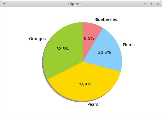
labels = ['Oranges', 'Pears', 'Plums', 'Blueberries']
quantity = [38, 45, 24, 10]
colors = ['yellowgreen', 'gold', 'lightskyblue', 'lightcoral']
plt.pie(quantity, labels=labels, colors=colors, autopct='%1.1f%%',
shadow=True, startangle=90)
plt.axis('equal')
plt.show()
The example creates a pie chart.
labels = ['Oranges', 'Pears', 'Plums', 'Blueberries']
quantity = [38, 45, 24, 10]
We have labels and corresponding quantities.
colors = ['yellowgreen', 'gold', 'lightskyblue', 'lightcoral']
We define colours for the pie chart's slices.
plt.pie(quantity, labels=labels, colors=colors, autopct='%1.1f%%',
    shadow=True, startangle=90)
The pie chart is generated with the pie function. The autopct
is responsible for displaying percentages in the chart's wedges.
plt.axis('equal')
We set an equal aspect ratio so that the pie is drawn as a circle.
Piechart explodes
We can visually separate one or more slices with explodes.
#!/usr/bin/python

import matplotlib.pyplot as plt

labels = ['FreeBSD', 'NetBSD', 'Linux', 'Window', 'Apple']
quantity = [4, 3, 12, 6, 2]
explodes = [0.2, 0, 0, 0, 0]

plt.pie(quantity, labels=labels, explode=explodes, autopct='%1.1f%%')
plt.axis('equal')

plt.savefig('piechart3.png')
In the example, we first item is separated from the others.
Source
In this article we have created scatter, line, bar, and pie charts with Matplotlib library.
Author
List all Python tutorials.